Labrains
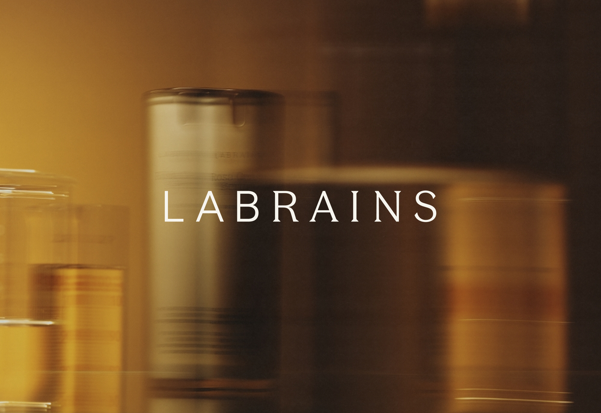
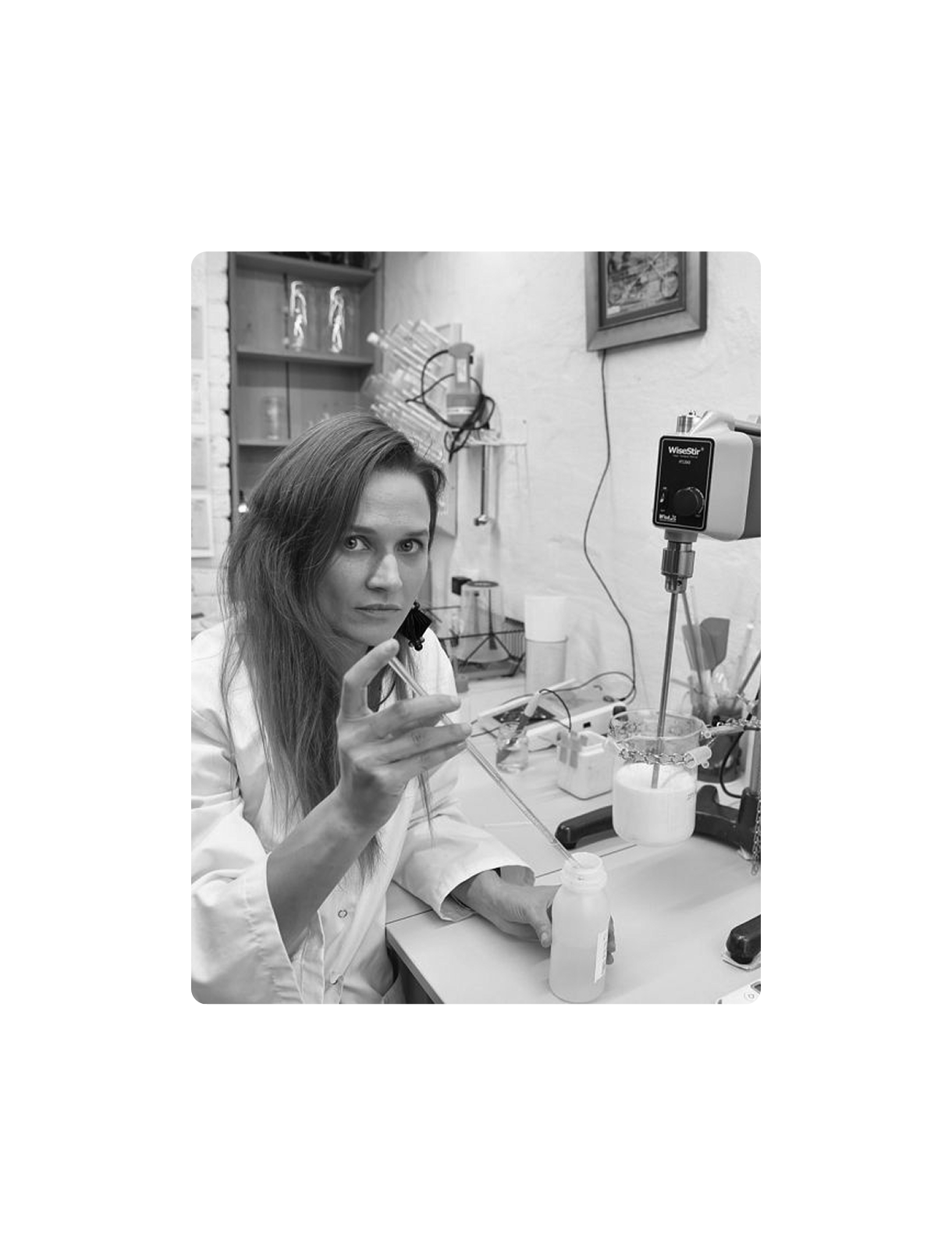
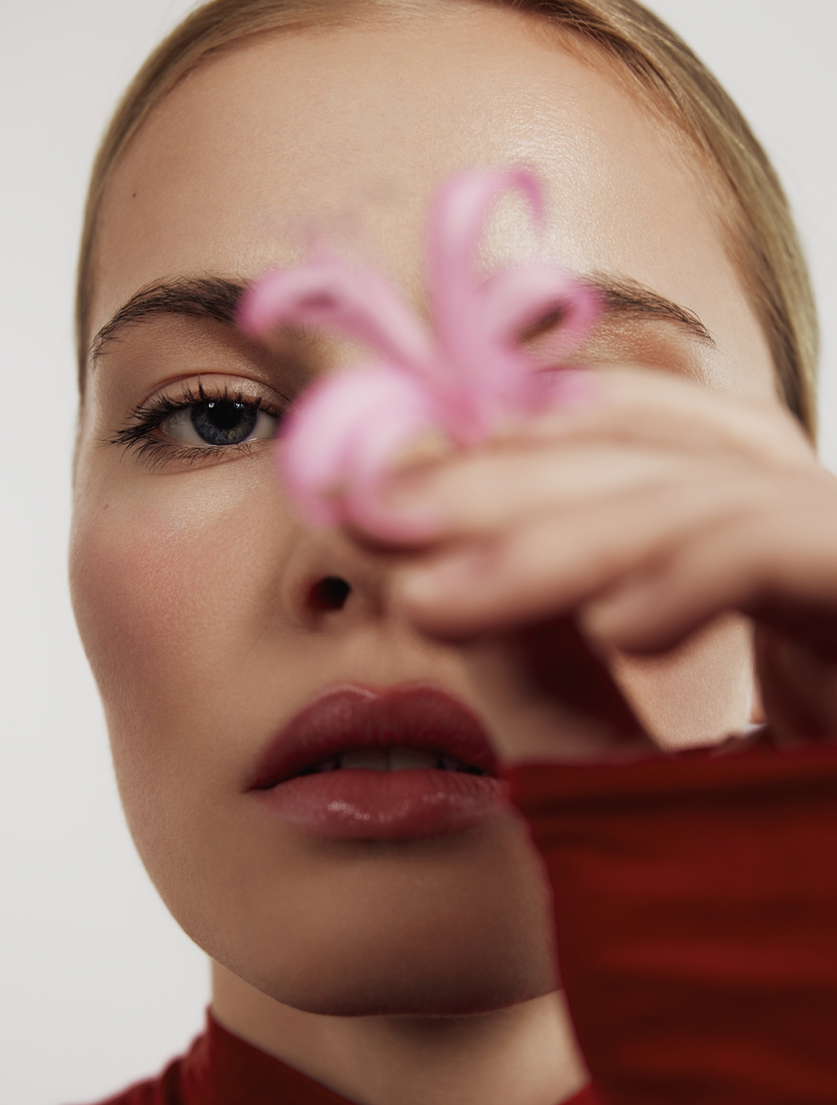
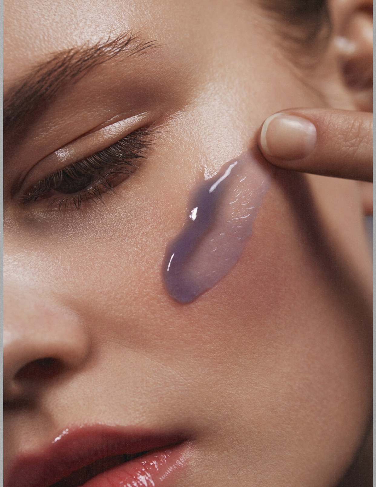
Labrains founder Līga Brūniņa, started to develop her own formulations after struggling to find remedies for her severe rosacea. Combining chemistry and sustainability, she created gentle, eco-friendly products that restore skin health and balance. Evolving rather than replacing, the updated identity ensures continuity for their long-term customers.
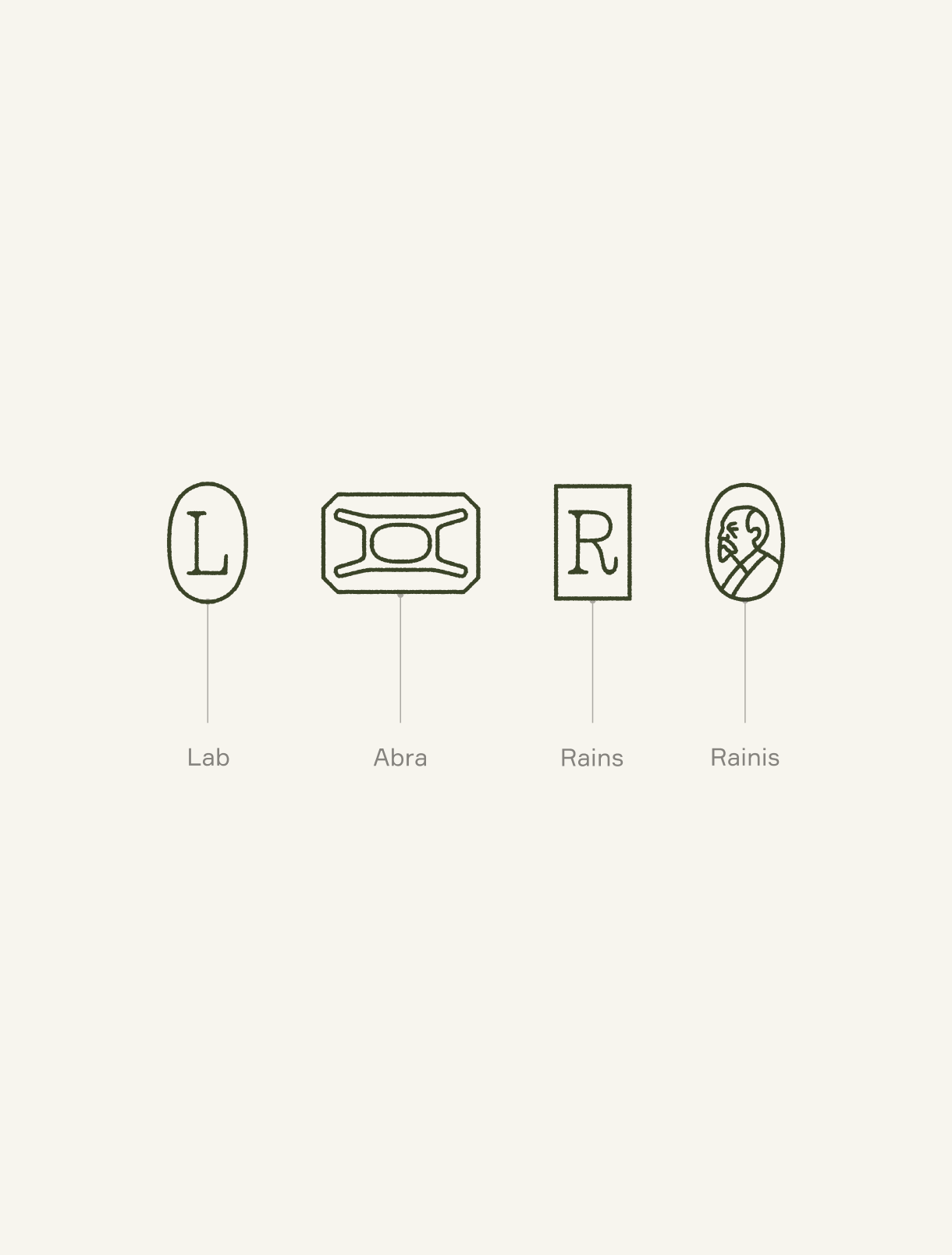
We’ve streamlined the wordmark for maximum utility, shifting its more complex conceptual details into a supporting set of brand symbols. This allows the wordmark to remain clean and legible, while the new iconography carries a deeper narrative of the Labrains brand. For Labrains team, these symbols hold a deeply symbolic meaning, serving as a direct reflection of the core values that guide everything they do. The mix of serif and sans-serif typefaces serves as a visual metaphor for Labrains brand's foundation: where natural ingredients meet scientific precision.
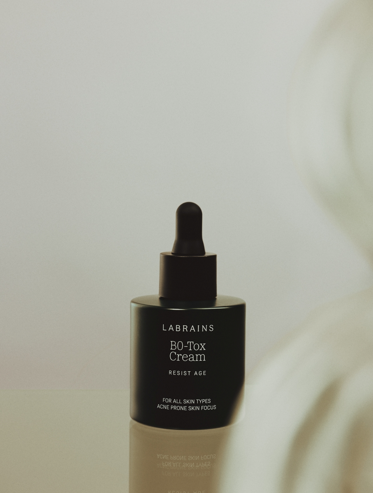
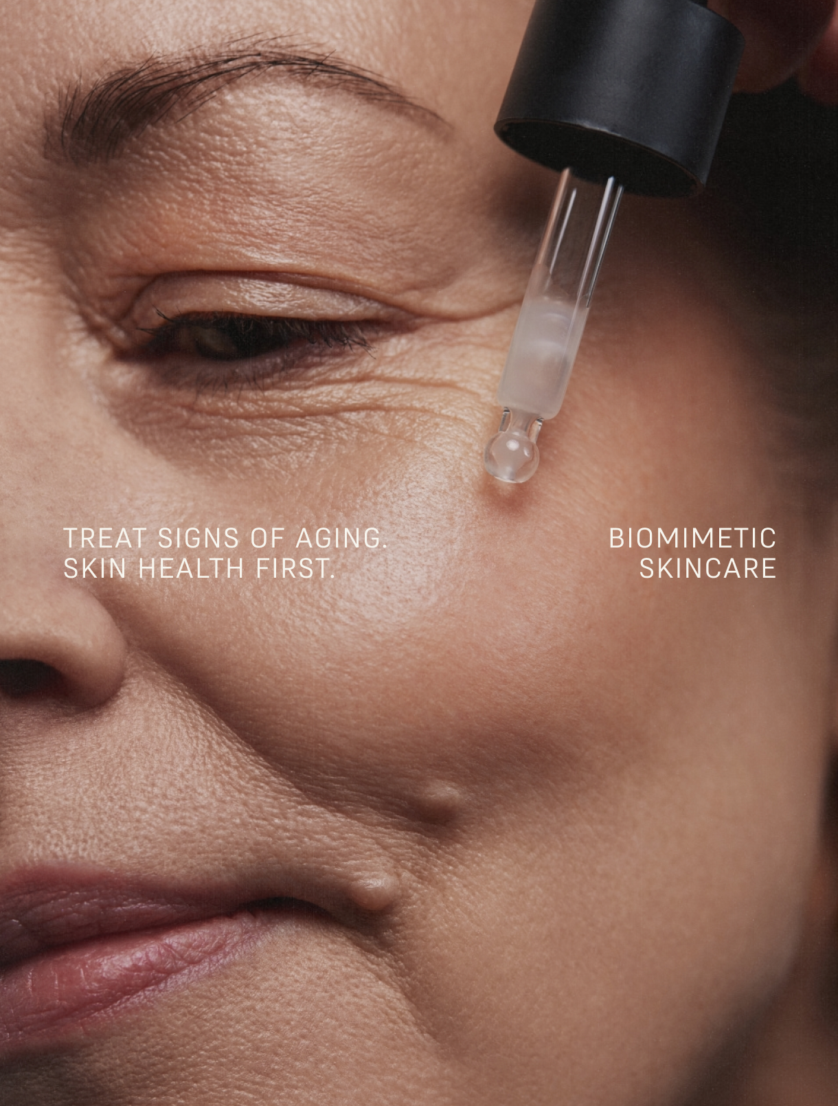
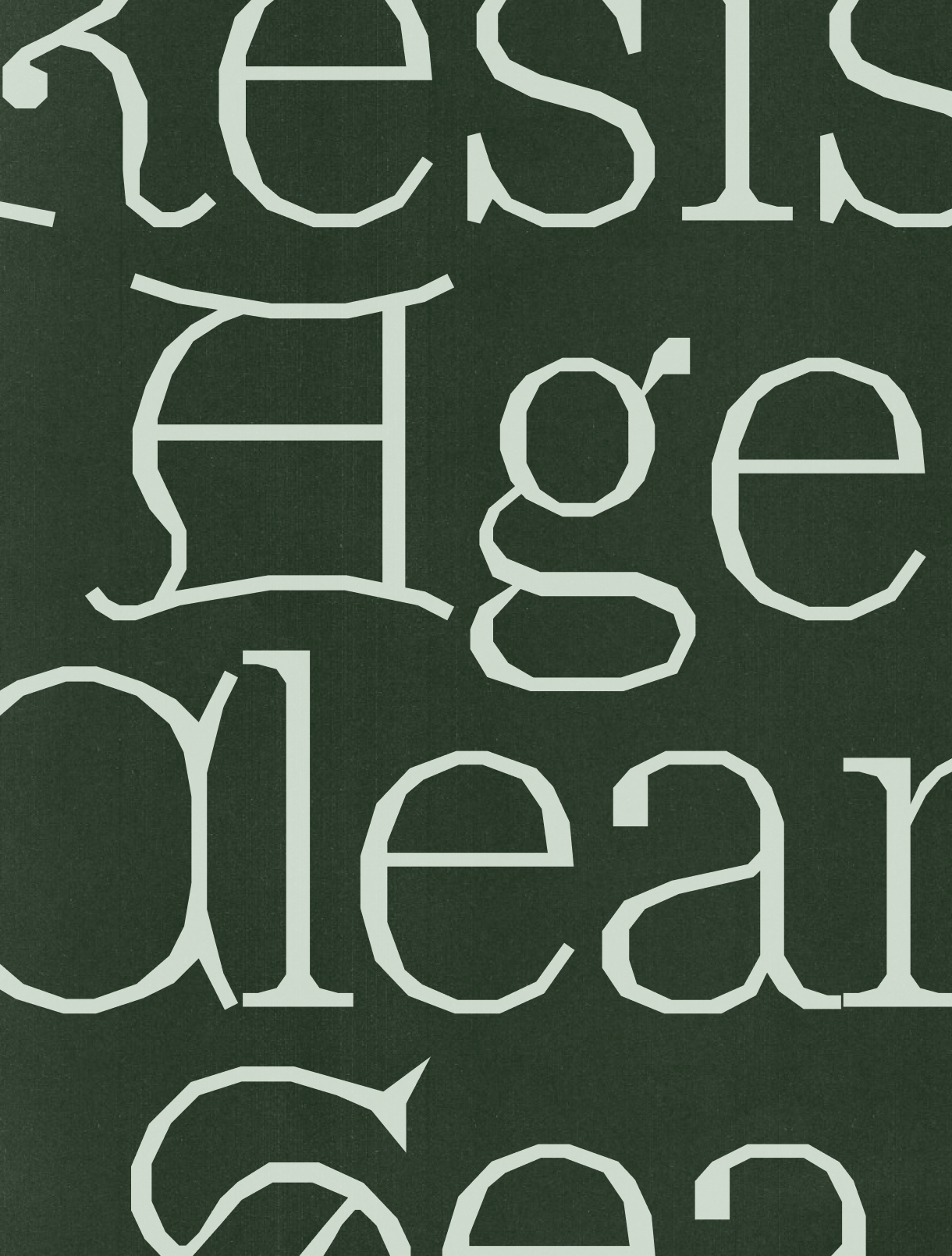
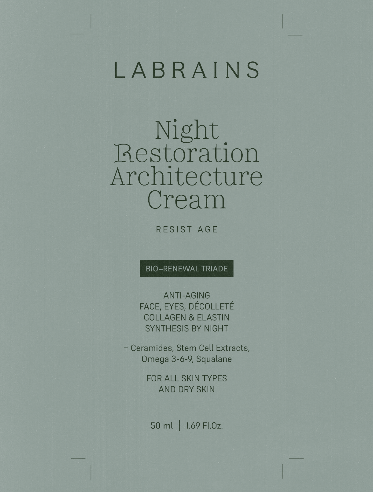
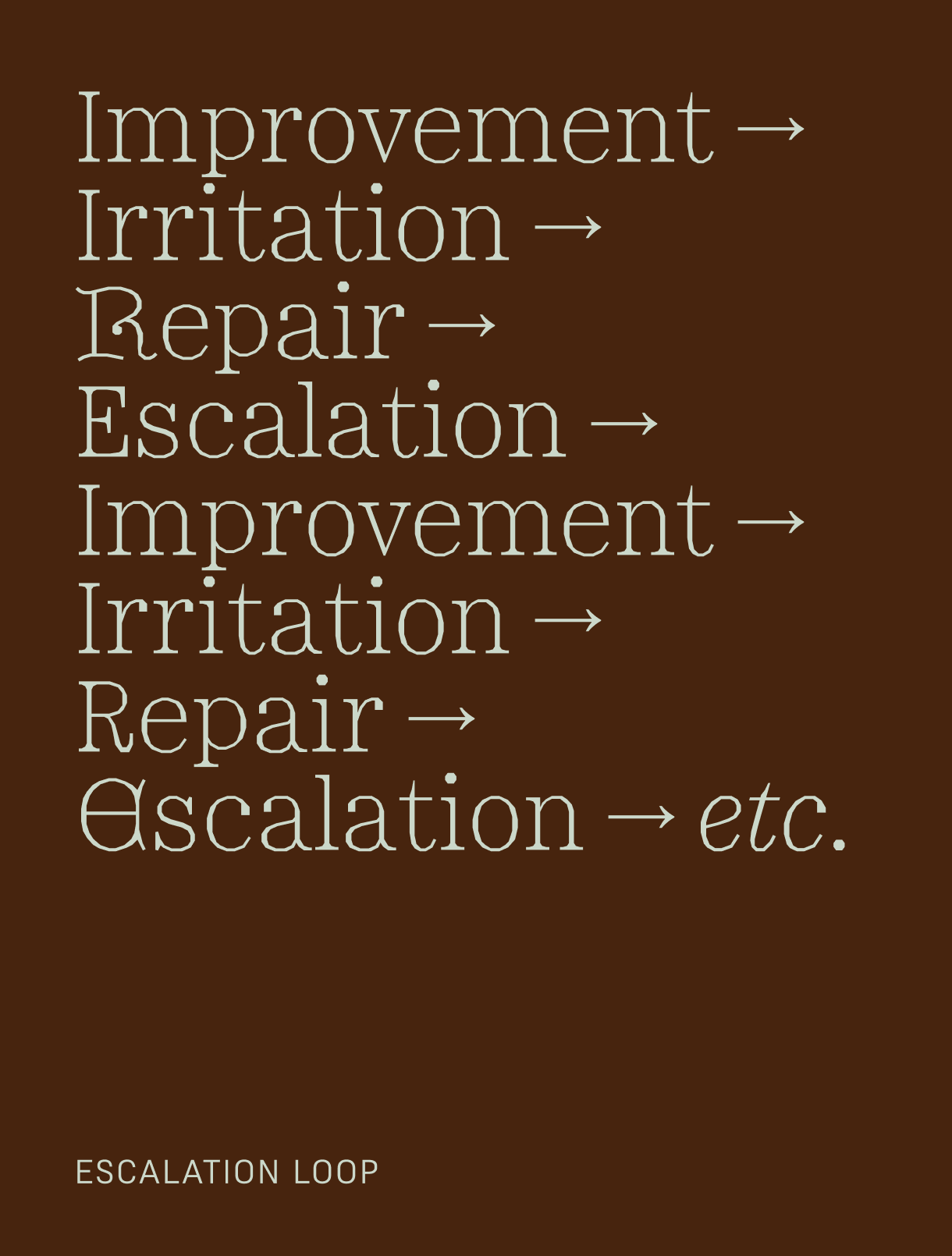
Reflecting their artisanal, small-batch approach, we chose a typeface deeply connected to traditional craftsmanship. Minotaur by Production Type incorporates elegant Lombardic accents, mirroring Labrains' fusion of precision and nature. Brand’s muted hues were inspired by the organic stratification of earth layers and skin.
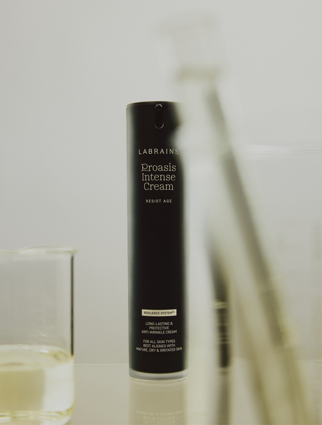
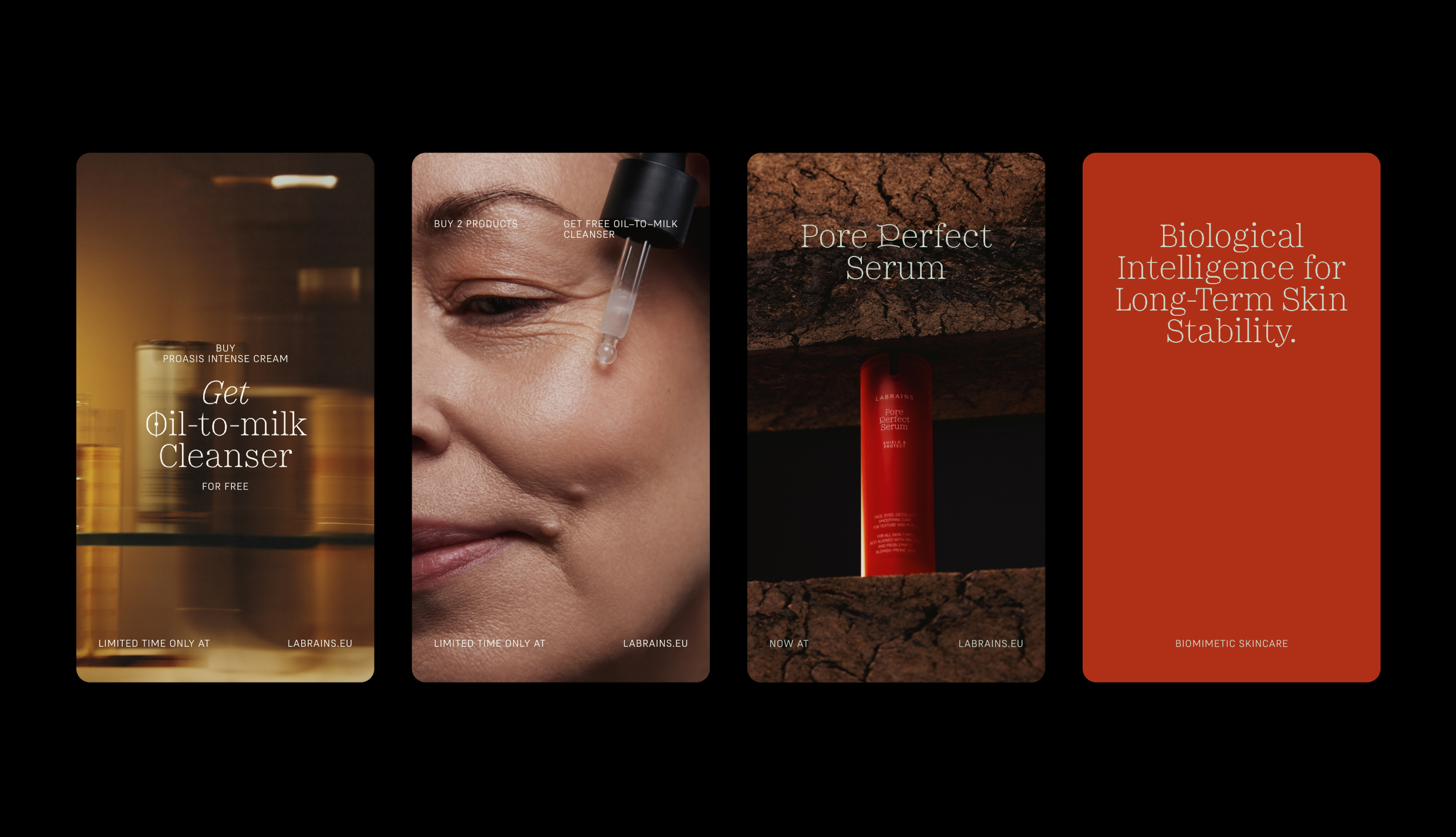
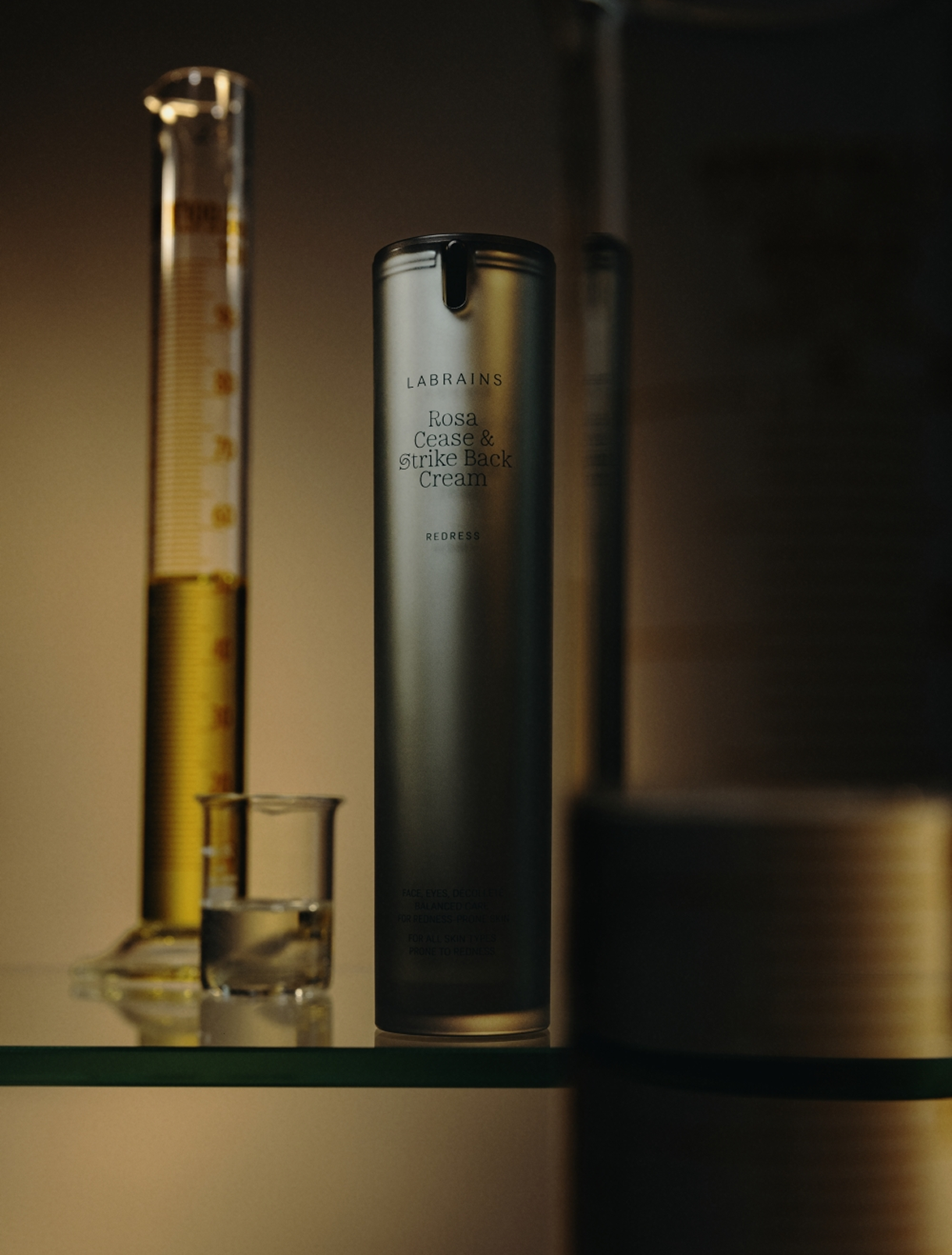
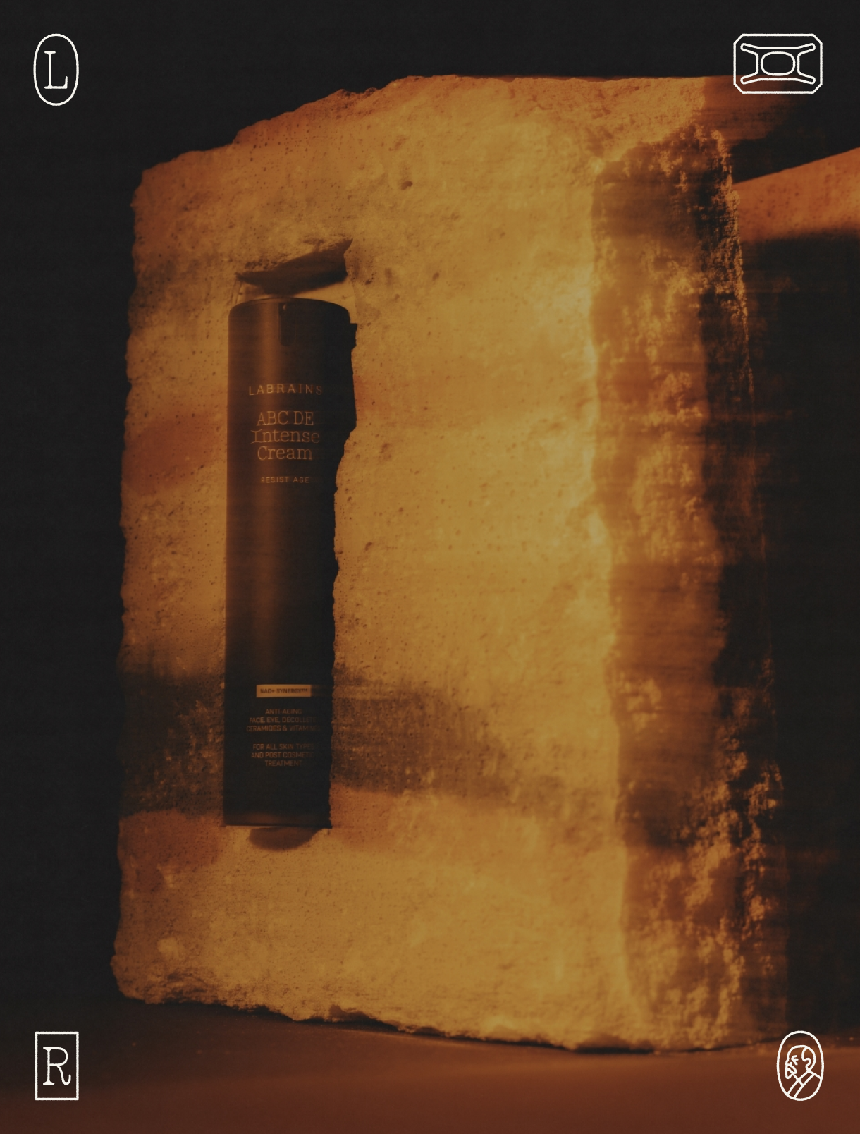
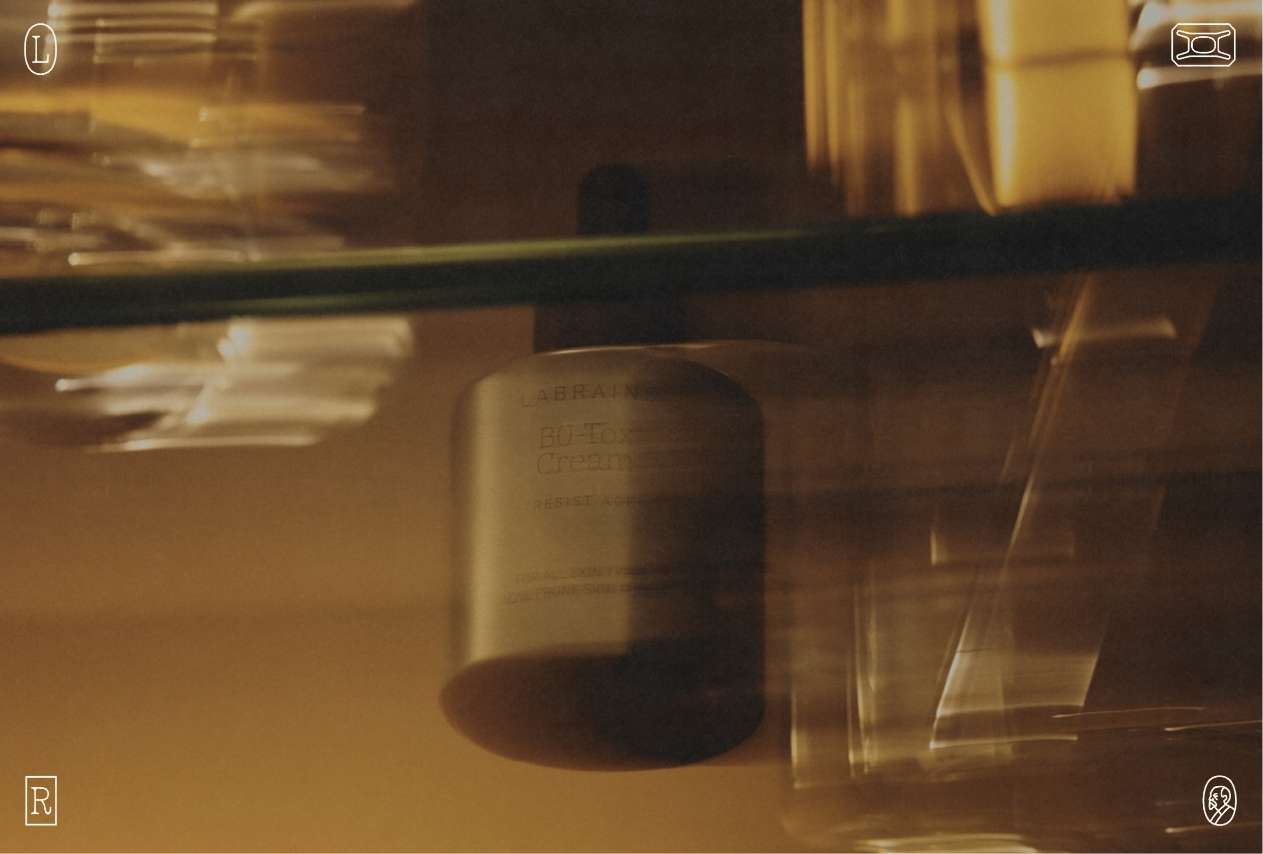
Designed to maximize brand recognition in alignment with their market positioning, this packaging system establishes a cohesive visual foundation for future product lines. Beyond elevating brand visibility, the structured design framework streamlines daily fulfillment, eliminating guesswork for the internal team.





.jpg)