Omniva
Our main task was to work with the market leader brand that is already loved by many, therefore the new brand system had to be very respectful of the pathways already laid out. Additionally a refreshed hierarchy and product consolidation helped to communicate more clearly and match the tone of voice with the factual leadership of the brand.
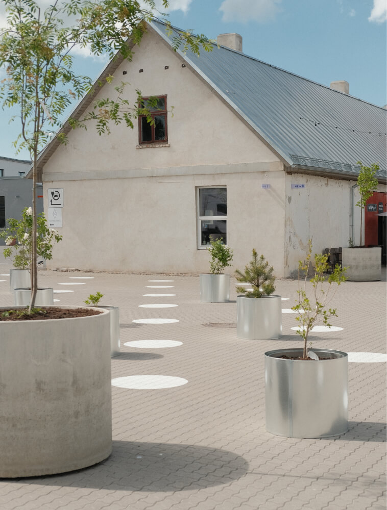
The new system gently transforms the historic logo by giving it more action and joy. The colour palette is amplified and brings more energy to the whole brand system. Along with the rest of the brand system, the whole auto-park, packomats and physical spaces of Omniva stores gain united visual language and strengthen the brand.
New brand language of Omniva with new colour-ways, photography direction and energetic motion graphics.
Brand system taking also physical shape in Omniva stores.


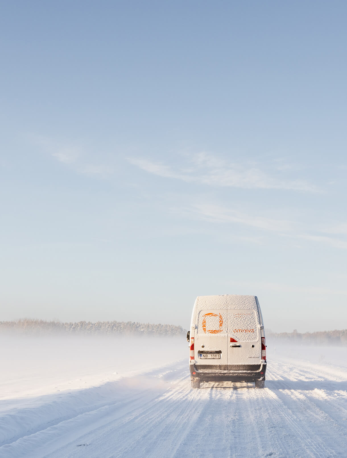
Since the relaunch of the brand it has been successfully implemented in all Baltic countries with much bolder communication that is consistent across all platforms — logistics, digital and physical spaces. One of the main recognition elements — the van now with a bold pop of colour.


.jpg)