Kaļķu kvartāls

Our task was to design a navigation system that felt native to the quarter itself. The core principle was simple but ambitious: everything had to be produced on site, involving the quarter’s own residents and workshops. This meant working closely with a local metalworking studio and a tinsmith’s workshop, ensuring that the design was not just visually integrated but physically embedded in the place it serves.


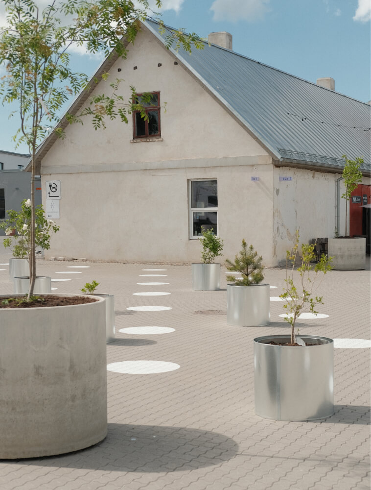
Together with architects, we rethought pedestrian and vehicle movement throughout the area, clarifying flows without over-regulating them by graphic elements painted directly onto the ground surface. These markings help organize movement and orientation while reinforcing the quarter’s visual identity. The approach allowed graphics, architecture, and urban flow to work as a single system rather than separate layers.

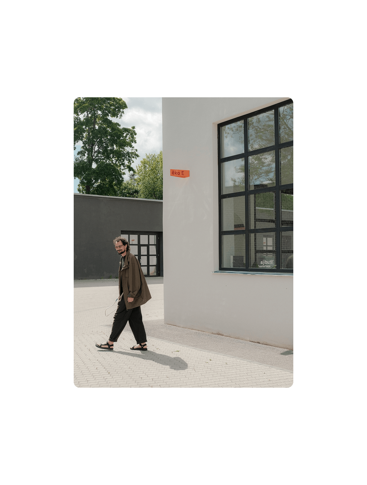
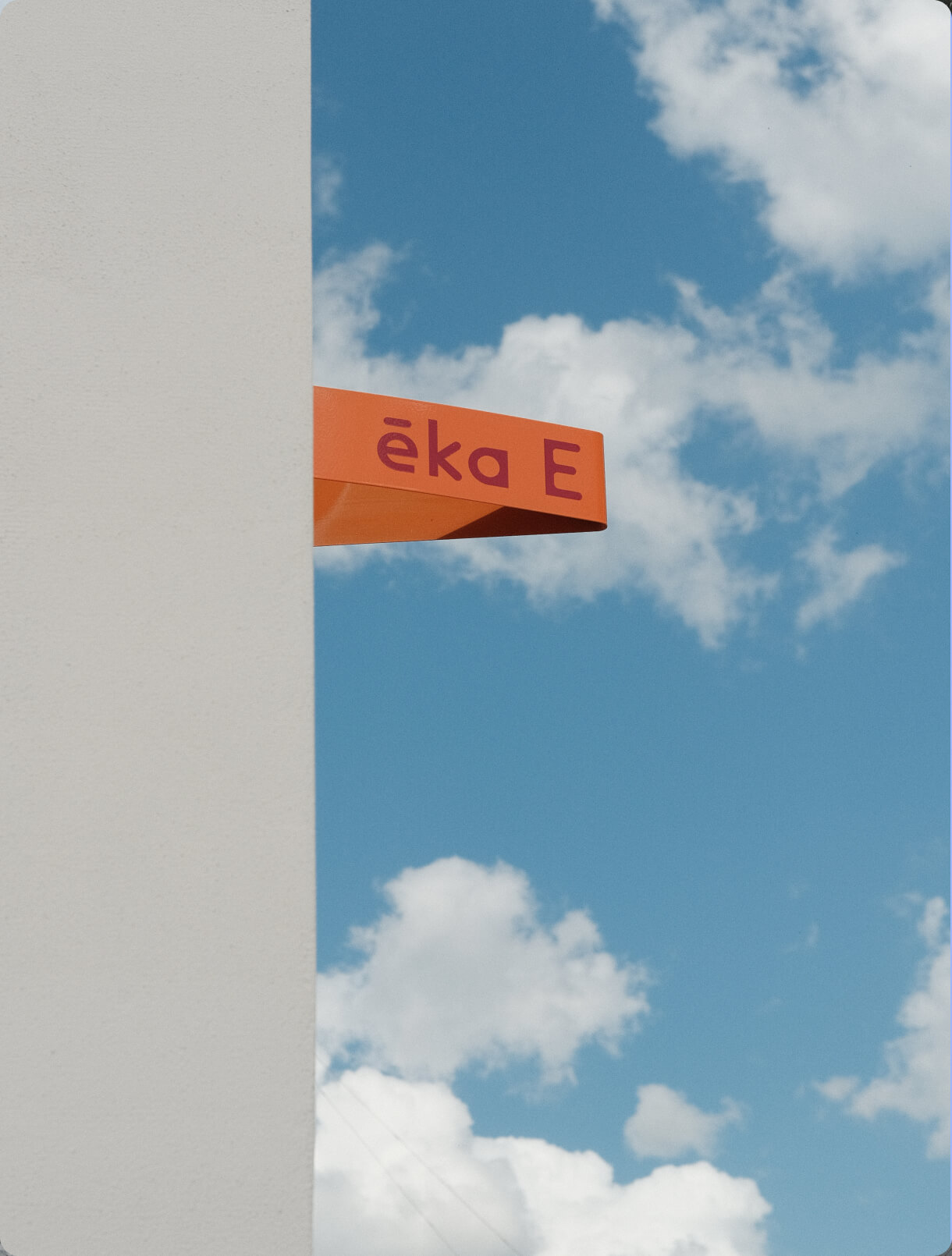
The graphic design language extended beyond signage. We developed clear color and marking principles for buildings. The resulting system is intentionally simple, intuitive, and readable from a distance. Building signage elements were shaped from metal into distinctive V-shaped signs — playful “beaks” that guide visitors.


A lively yet restrained color palette brings a sense of playfulness to the industrial environment, softening its rough edges without erasing its history. Tin-crafted planters, metal plates, wooden benches, and hand-made signage elements reinforce the idea of a living, self-sustaining quarter. The result is an original, locally produced wayfinding solution that reflects the spirit of Kaļķu Street Quarter — practical, collaborative, and deeply rooted in its community.


.jpg)